Check out FBA’s new logo
Posted on December 1st, 2021
FBA’s logo has undergone a change to elements of its design, creating a more modern look, while retaining the strong earthen colours that connect it to the region and FBA’s heritage.
FBA’s brand consistency is a fundamental part of how we communicate, representing FBA’s core values, brand promise, customer experience, and identity.
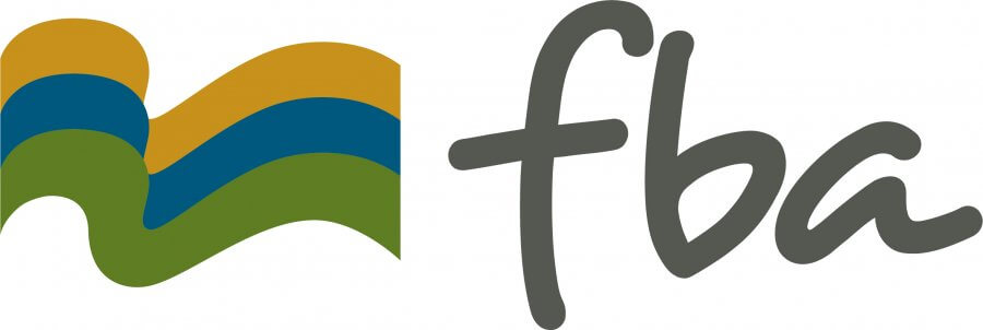
The new design eliminates the words Fitzroy Basin Association previously located under the tri-coloured flag image and updates the colour of the FBA letter text to grey.
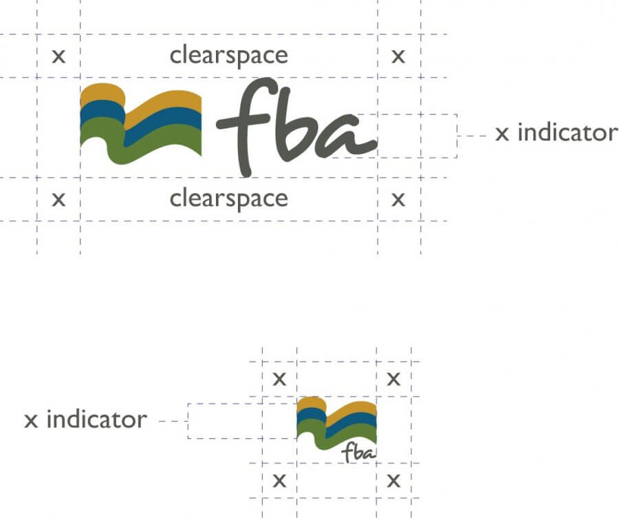
FBA asks those who wish to use its logo, to use the complete image and not just part of it. It is also most important to FBA that the old version of the logo is not used, no logo should be rearranged, and it should not be skewed or have its proportions distorted by stretching or squashing. The landscape version is preferred but a compact version is available if spacing is limited.
FBA is regularly involved in project co-branding. If you are a partner or investor and need to use the FBA logo, we ask that you first seek its approval.
Getting our brand and your brand right is an important part as accurate and genuine acknowledgement.
To request an FBA style guide and versions of the new FBA logo please contact FBA Communications Coordinator Johanna Ramsey.
P: (07) 4999 2800
